we looked on mobygratis for soundtrack music, we came across three different ones called ana.across and accident. weh have requested the soundtrack for ana and across and they should be with us by tomorrow so we can add them to our film. the song ana we have chosen to use when the ghost is wondering because it adds to the effect very well . both sounds are gentle and mysteruious which is perfect for the ghost bestfriends effect without making the film sound too much like a horror or spooky
Monday, 13 December 2010
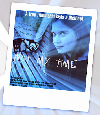
my film poster - not my time
click on image to view the film poster at a larger size>>>>>
this is my film poster for not my time. similar to my film review i have kept to the colours of black, blue and white as they all symbolises the death aspect and life after death, i have used lighter colours such as white and lighter shades of the coloru blue as this is about the spirit of a young nice girl who has raised from the dead. i used picnik to edit my original picture which is a picture of sphia moss the girl who plays lily, i used special effects such as circle splash which give the rays of light on the poster and boost which gives the whole picture the grey/bluey colour it has. i used these effects as they have the connotations of death, and being trapped between life and spirit, and it makes sophia look more ghost and like a little girl lost. i chose the slogan " a true friendship last a lifetime" because it really relates to the plot about two bestfriends and even though one is dead they are still bestfriends it also adds in with the idea that there is life after death. i also chose to use the polaroid effect as in our film the whole thing starts with the picture of the two girls when they were younger fools out and the film consists of backflashes so pictures are the memories whick bonds the two girls even after death. i tried to use writing which was edgy and a bit like child handwriting, i wanted to use edgy writing as the film is about life after death but didnt use to much because it is not a horror and i wanted to use childlike writing to emphasis the whole idea of childhood and bestfriends. i placed the font at the very top and bottom and at the left hand side as i wanted it to be noticable but id dint want to take away the focus of the main oicture especially of sophias face. i put the slogan at the top for thisa reason but also because a slogan is a very important part of a film poster it has to be seen a it has to catch ones eye. by placing it where i did it is very noticable and doenst take anything away from the image. like most film poster i put the actors names producers and directors and any othe riformation at the bottom is a block of writing alltogether. this is because even though this information is important it is nothing something that will appeal to the audience or catcht their eye, obviously the stars in the movie are very imprtant and can genuiuenly make the audience want to see the film depending on who is in so i put the actresses also on the left hand side as well as ina smaller print at the bottom.
not my time - my magzine review
please click on picture to make film review larger >>>>>>>>>>
this is my magazine film review for our short film not my time. i chose to use a large image for the main picture as this is popular convention in magaxine reviews and i used a smaller image from the film as well to give people an idea of the genre of the film. i chose to use two colour blu and black i used these two colours becaue one, they have the conventions of a drama, genre and symbolises greatly in the conceots of death and i also used these two colours as they work really well together and i didnt want to over do it by using different colours and taking the readers eye away from the main point which is obviously the review of the film. like most reviews ui chose to give mine a star rating which was 5. in my description i uncluded the producers, a very short synopsisi of the films plot, a little of detail of the producers of the film and any mistakes were made and a quote from the film director steven spilberg to add even more temptation for the reader to go out and watch the film.
magazine review
this is the magazine film review is for the film avatar, we can see straight away that the a3 spreedsheet mainly consist of images, the main image is the largew image on the page taken from a key point in the film. surrounding it are smalelr images of othere scenes in the film, from the image we get an idea of the genre of the film and ideas of what may be happening in the film. this is good as them the audience get a "teaser" and by doing this it can make a reader really want to go see the film, this is good publicity. the main things that this magazine review include are the images, the name, the star rating, information about the film, the producers, directors, actors and small but detailed plot, which gives an idea of the plot of the film but not enough to give too much away. the colours are orange black white and blue, they have kept the colours basic and in line with the sci fi genre of the film. the font ans size of the writing is kept the same the throughout and the pulblisher as concentraited on making it descripted and symbloic without making it too "fancy".
this is magazine film review of short film "APPLE" this film review consist of a number of smaller images rather than a lrage main image which is often seen in film magazines for full length films. the colours are simplisitc green, white background and black font, it is also again quite detailed in the writing. unlike a lot of film reviews this one has plenty of uncovered space, we can see rather alot of the white background which is not often seen. they have images similar to the images on the i am legend of the short film actually being filmed and not just still images from the film. it tells you who produced the film and how they went about filming the film and the plot to the film, again they gave it the ratings 9/10 however you usually see it in the five star rating convention.
production logo
Subscribe to:
Posts (Atom)